Desktop Behaviour vs Mobile Device Behaviour
The following covers differences in the display settings and user interface for filter sets on both Desktop and Mobile devices. It will also show you ways in which the filter set can be configured to look and function differently on Desktop and Mobile.
Filter Sets
On the Filter Sets page, the top bar of each Filter type will indicate whether the filter is used on Desktop, Mobile or Both:

Whilst creating or editing a filter set, you can choose to display each filter on Desktop and Mobile, Desktop only or Mobile only.

Different versions on Desktop and Mobile
You can create different versions of the same filter for desktop and mobile with different filter mechanisms/display settings.
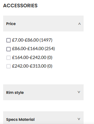
For example, you can create two Price filters, one for desktop and one for mobile (note only one can be set up as a filter template). The desktop version could be displayed as a slider, but the mobile version could be displayed using ranges that are easier to use on a mobile device.
To do this, change the Display on setting for each instance so it looks like this after updating.

View on Initial Loading
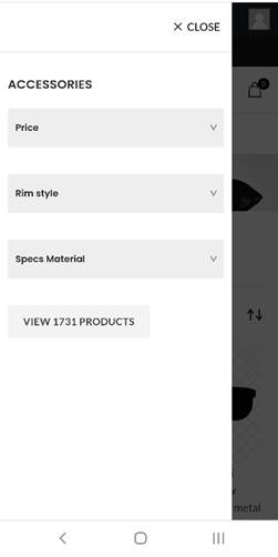
You can choose whether filters are open or closed on page load, for example, you could have them collapsed on initial load on mobile so the customer only opens the one they want to use.
To do this, select the Mobile-only filter and choose the “Collapsed on Initial Load” option against “Panel Visibility.

Click update and view the display on a mobile device. It will now appear as –

While the desktop version can be left at Expanded on initial load to display it as –

Accessing filters on a mobile device
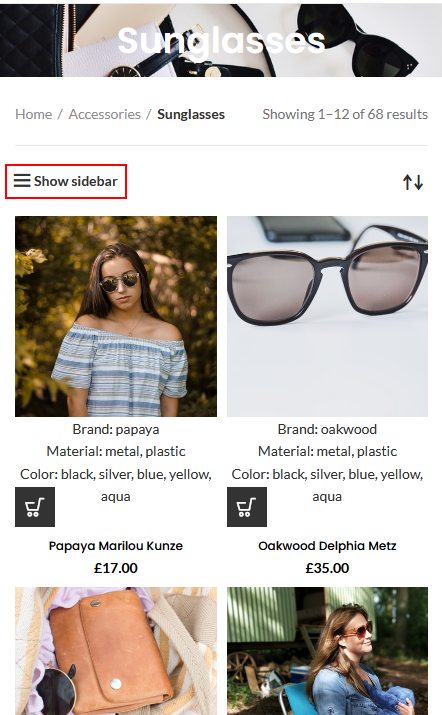
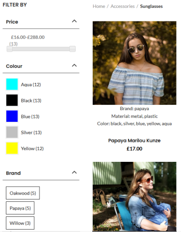
Filter sets will appear in an overlay on mobile devices, as opposed to the desktop view where they will appear in the Site Sidebar. Note the mobile overlay still uses the widget in the Shop Sidebar. Some themes may position the sidebar differently, but usually, the Administrator can manage this in Theme Settings.
Mobile View

Desktop View

Related Articles

